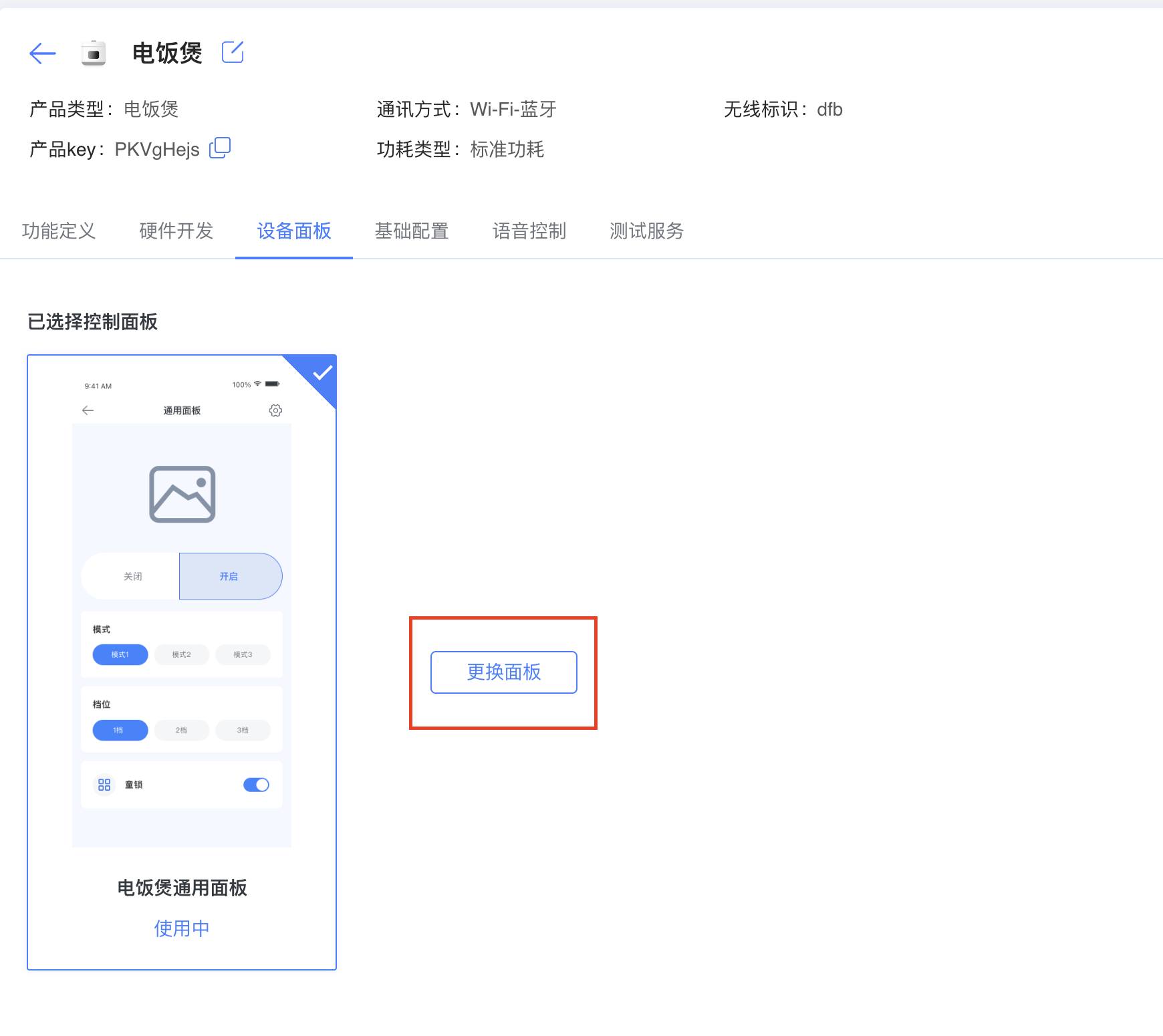

Control Panel Generator
In the IoT era, the device control panel is a key interface between users and devices. However, manually writing UI code can be difficult and tedious for non-technical users. To solve this, we developed a drag-and-drop control panel generator that helps developers quickly create device control panels without writing UI code by hand.
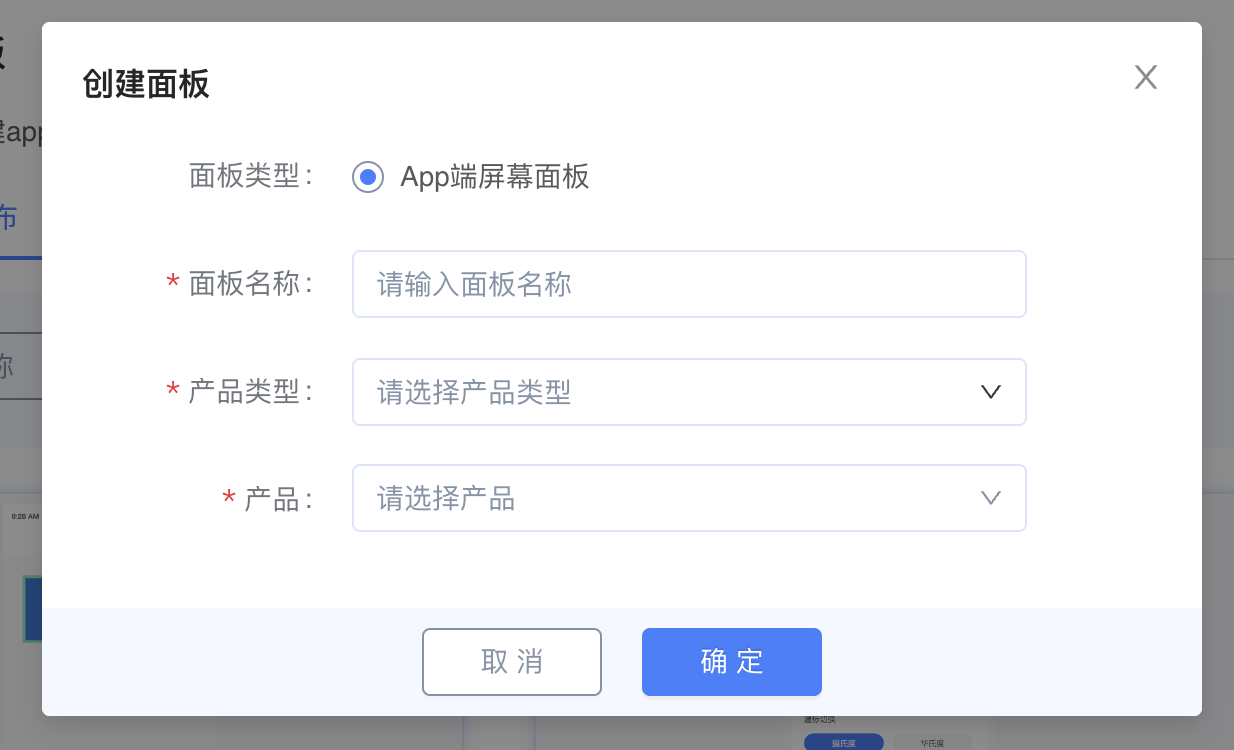
1. Create a Panel
Prerequisite: First create a product in Product Development and define related features;
Quickly create a control panel that matches your product based on the defined product and features.
2. Design the Panel
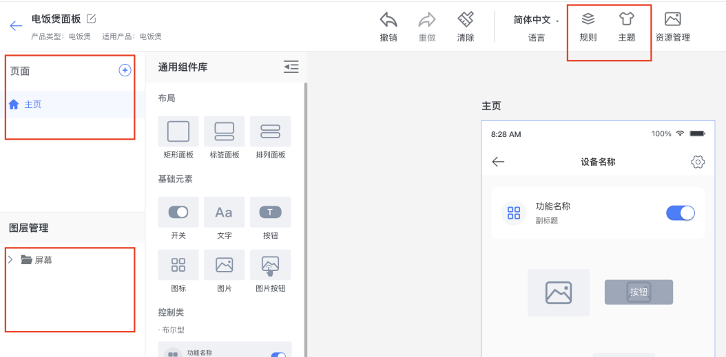
Based on product features, design the display pages, drag components onto the panel, and define styles and properties for each component;
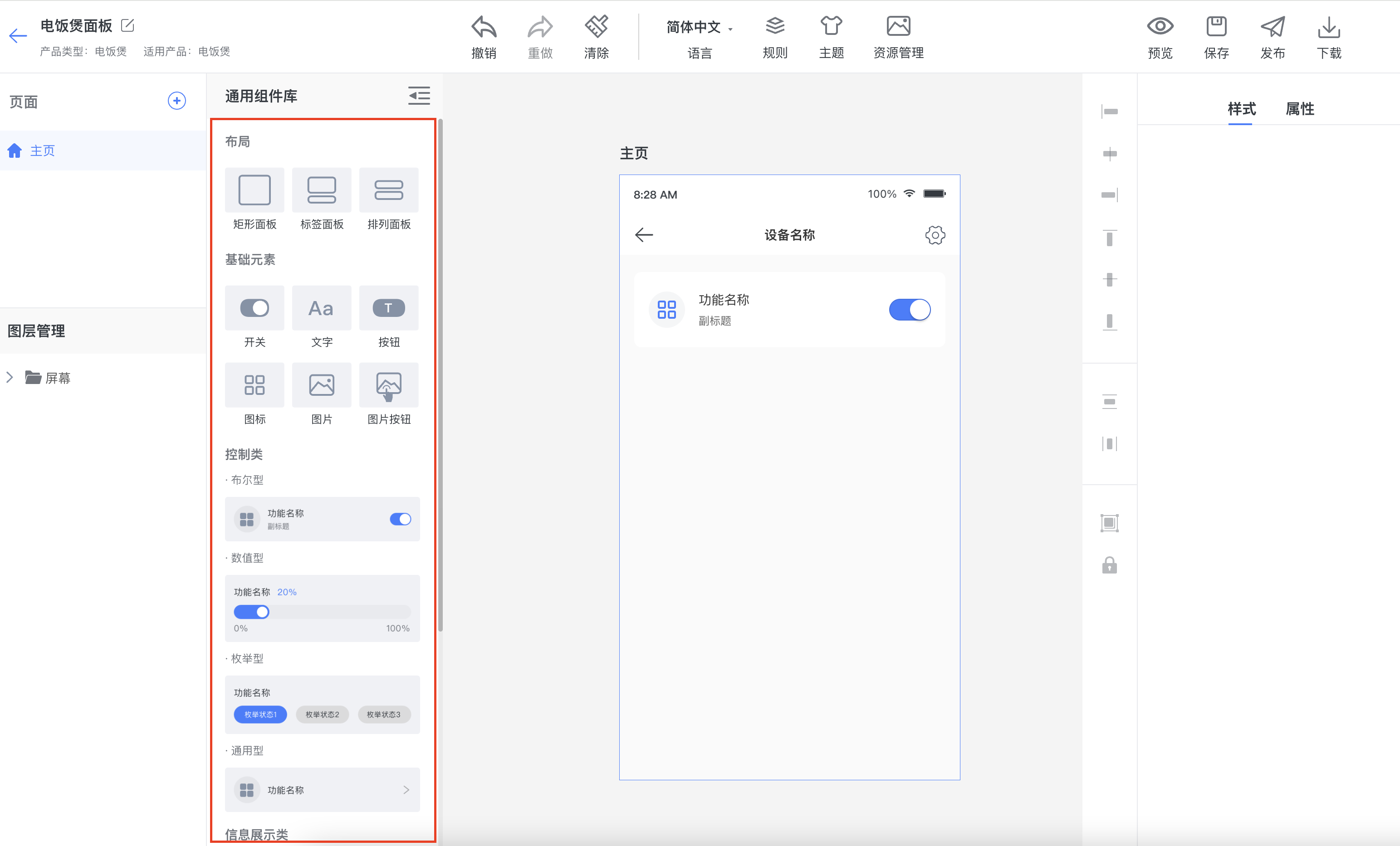
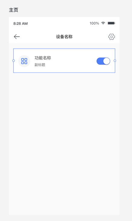
Taking a Boolean component as an example,
Style settings: Define feature name, subtitle, display icon, switch color, and other styles;
Function settings: In the component properties, bind the component to the corresponding Boolean data point (DP).
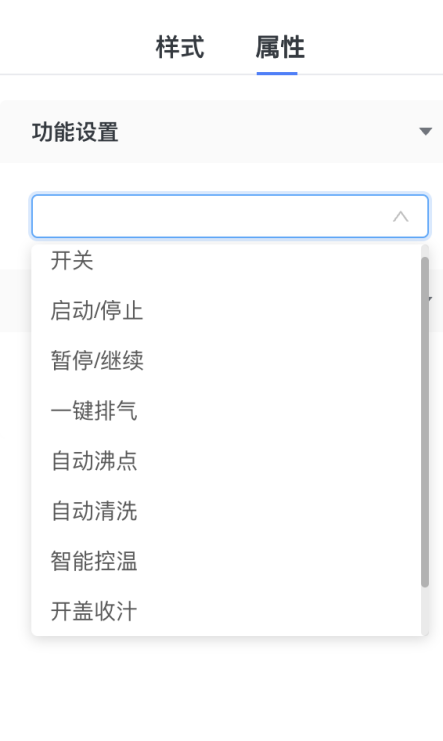
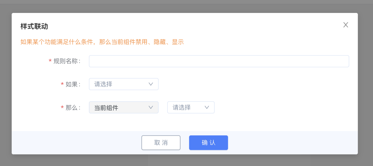
- Conditional styles: Disable, hide, or show the current component when a specified function meets a condition. For example, hide the component when the master power switch is off.
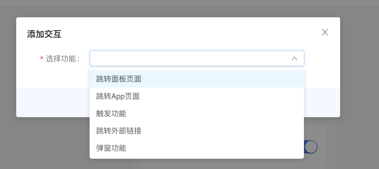
Some components also support interactions, such as navigating to another panel or App page, writing a data point, opening an external purchase link, or displaying a dialog.
The generator also supports multiple pages, layer management, themes for consistent component styling, and interaction rules.
3. Save the Panel
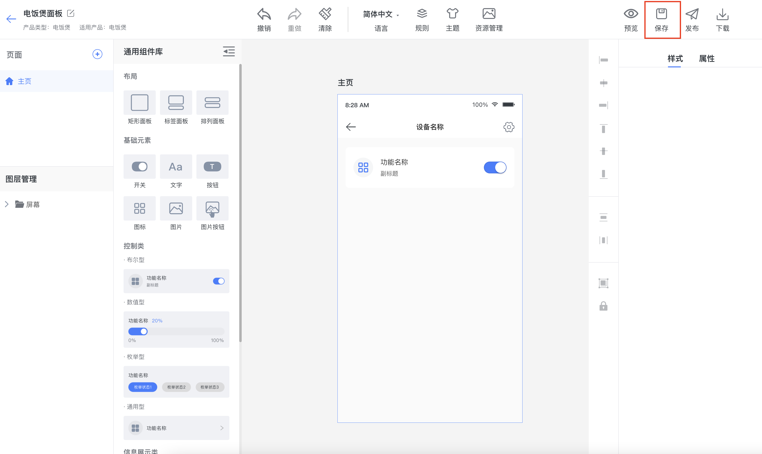
After editing panel features, save the panel promptly to avoid losing changes.
4. Preview the Panel
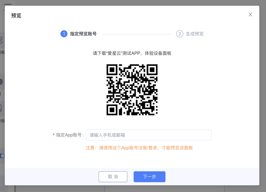
Download the specified App, sign in with an App account, and preview the panel in the App.
5. Publish the Panel
After preview looks correct, click Publish Panel.
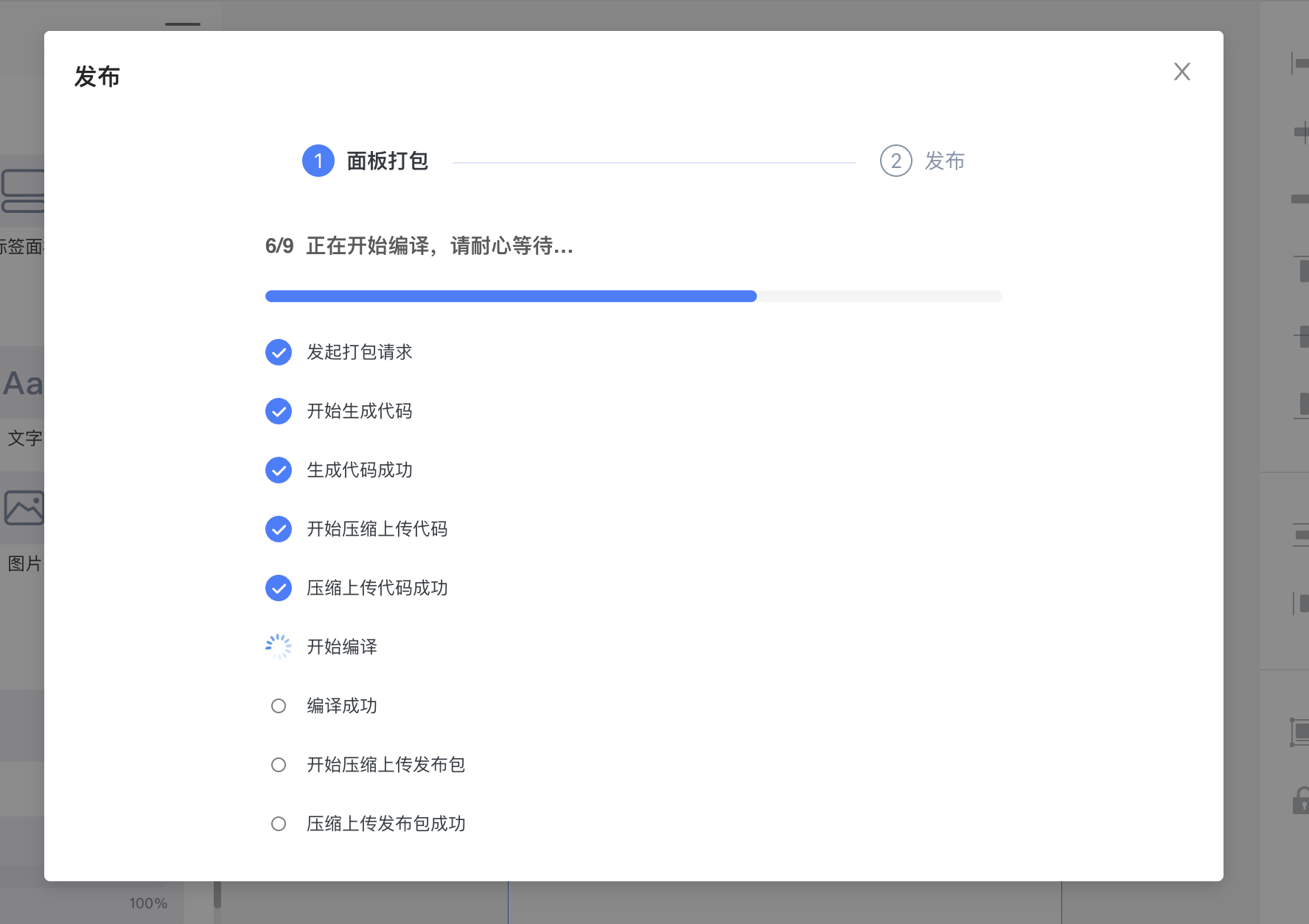
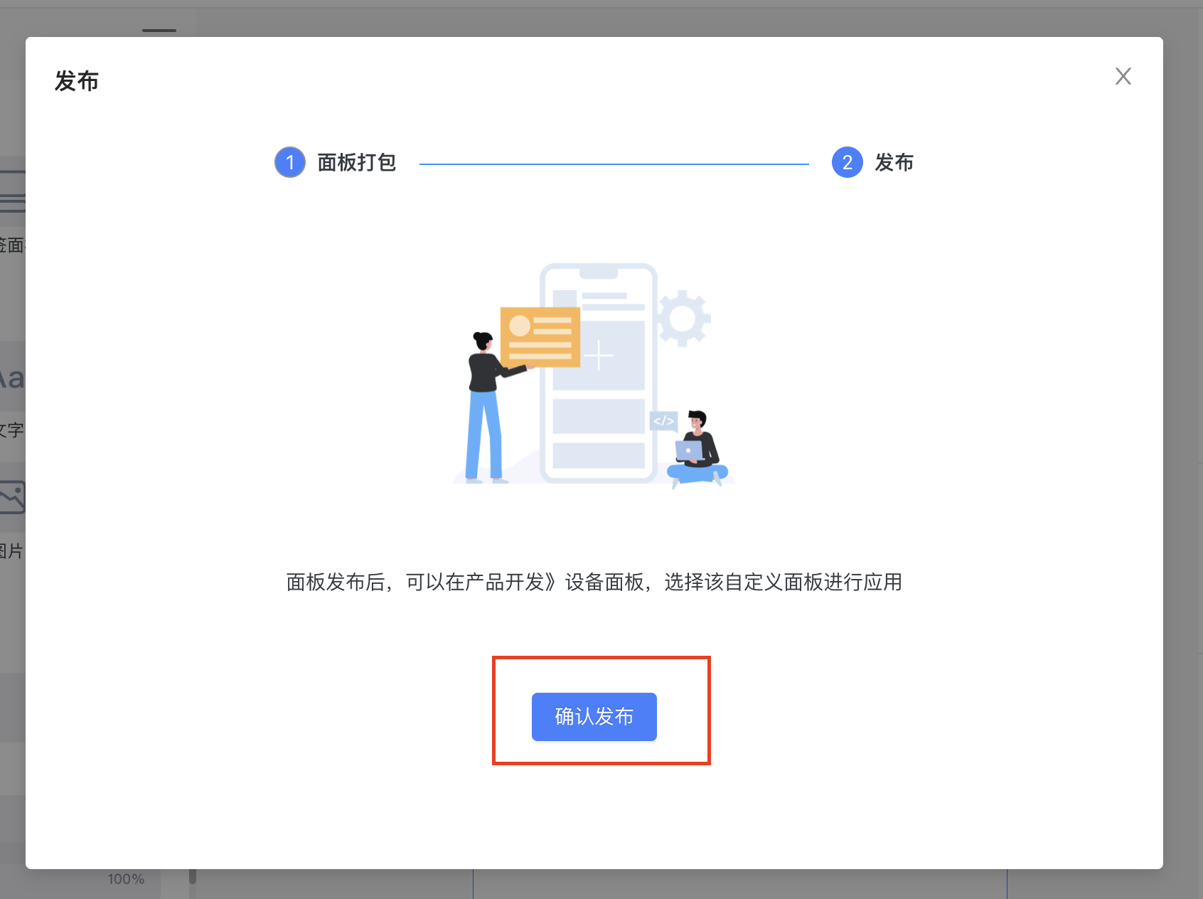
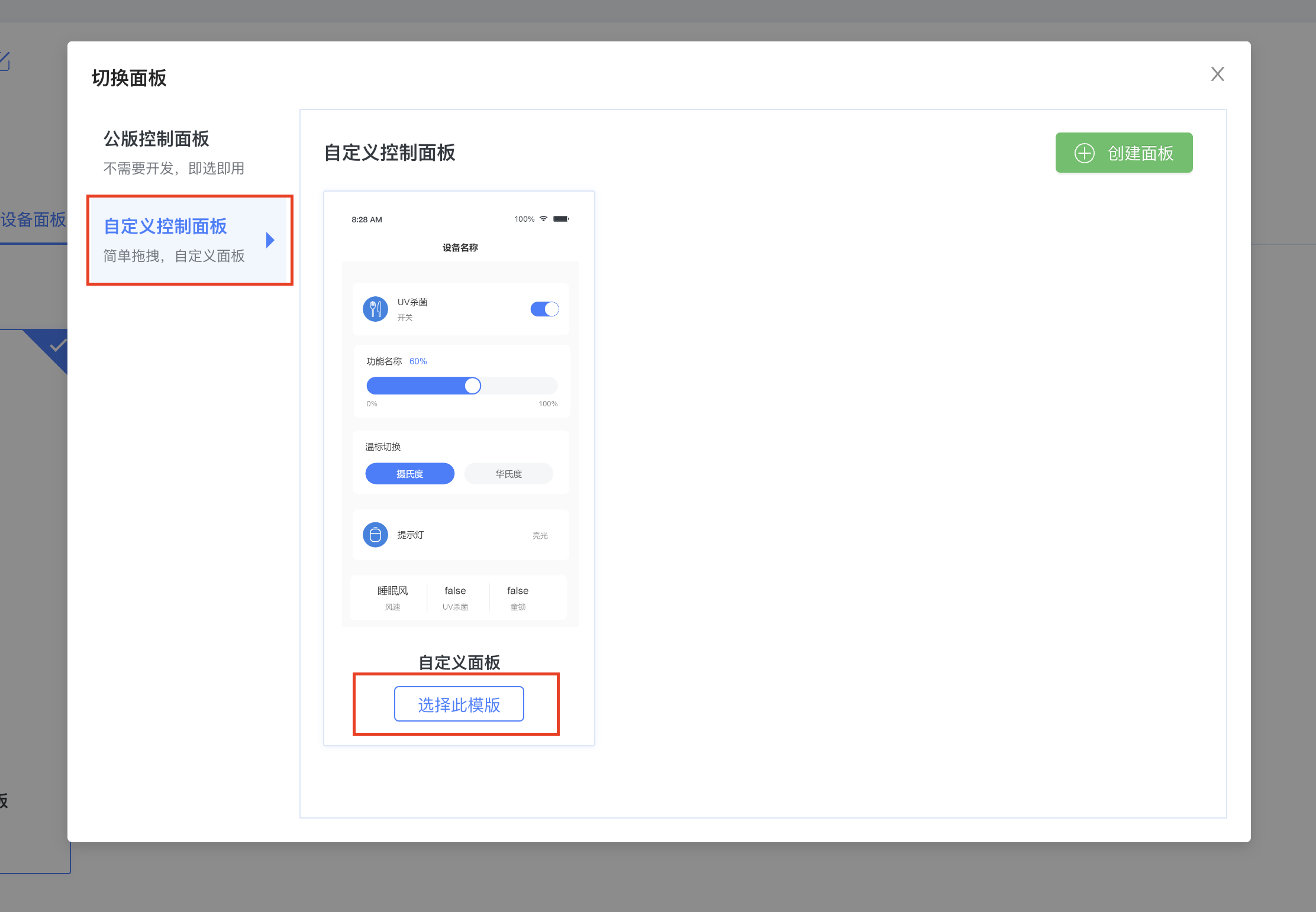
After the panel is published successfully, go to Product Development → Panel Management and select this custom panel to apply it.